The History of Bib The Michelin Man
Funky Junk Gazette
The History of Bib The Michelin Man
The mascot series begins with Bibendum, the official mascot of the Michelin tire company, who stands as one of the oldest surviving corporate mascots in modern advertising history.
He is one of the clearest examples of how a commercial character can evolve with technology, class culture, transportation habits, and graphic design trends across more than a century.

The origin story begins in 1894 at the Lyon Universal Exhibition in France, where brothers Édouard and André Michelin reportedly noticed a stack of tires arranged upright.
The stacked tires suggested the outline of a human body, and the brothers observed that if the pile had arms, it would resemble a man.
That observation became the visual seed of a mascot that would later achieve global recognition, at a time when the automobile industry was still young.
Tires were a visible technological problem as much as a product category, so manufacturers needed to persuade the public that pneumatic tires were durable, practical, and worth adopting.
A mascot gave Michelin a way to explain those claims visually.
In 1898, Michelin worked with French illustrator Marius Rossillon, who used the professional name O’Galop, to adapt the earlier idea into a formal advertising image.
He created the first famous Bibendum poster for Michelin, featuring a figure made from many narrow white tires stacked into a body.
That white appearance reflected the natural color of rubber before the widespread use of carbon black additives that later made tires black.
The name Bibendum came from the Latin phrase “Nunc est bibendum,” which is commonly translated as “Now is the time to drink.”
Michelin repurposed the line for advertising, and in the poster, Bibendum raises a glass filled with nails, broken glass, and road debris.
The message was that Michelin tires could consume rough road hazards that would destroy inferior tires, which was a clever metaphor for durability.

This early version of Bibendum reflected the social world of the first automobile owners, back when cars were expensive and centered on wealthy buyers.
The market for motoring products initially focused on sportsmen, industrialists, and upper-class travelers, so early Bibendum often appeared with markers of status.
Artists gave him spectacles, a monocle, or a cigar, and his posture often suggested a sense of confidence, appetite, and control.
He did not originally function as a children’s mascot or a soft family symbol, but instead served as a persuasive spokesman for a premium industrial product.
The original imagery can look strange to modern viewers.
A smiling figure made of tires drinking shattered glass is not intuitive by current branding standards.
Yet that exaggeration made sense within poster design of the late nineteenth and early twentieth centuries.
Advertising relied on bold symbolism because posters had to communicate instantly in public spaces.
Bibendum’s body was simple enough to recognize at a distance.
His gestures were theatrical enough to make the sales point memorable.

The first Bibendum poster became important not only for Michelin but also for advertising history, as it demonstrated how a mascot could condense product performance into a single repeatable visual idea.
Rather than describing rubber compounds or puncture resistance in technical language alone, Michelin used a character to dramatize durability.
That strategy gave the company an advantage in an era when branding systems were still developing, and Bibendum soon appeared across posters and print advertisements.
His image traveled well across language barriers, because the body made of tires identified the company even when the viewer could not read the full text.
That visual economy helped Michelin expand beyond a local brand identity and reach a much wider international audience.
As Michelin’s customer base widened, Bibendum changed to reflect the fact that automobile ownership was slowly moving beyond elite circles.
Companies needed friendlier public-facing identities, so Michelin gradually reduced the more aristocratic details in the mascot’s appearance.
The cigar disappeared, the eyewear became less prominent, and the figure eventually became rounder and more approachable.
Those changes were not trivial design edits, but instead marked a shift in who the company believed its primary customer was.

By the mid-twentieth century, Bibendum had become a durable object in commercial space, appearing in signs, figurines, and branded display pieces.
Service stations and garages used these items for promotion, and today they form a major category within vintage advertising collectibles.
Collectors often distinguish between paper advertising, enamel signage, and porcelain figures, all of which carry their own unique history.
Authentic older Bibendum pieces are valued for both design and survival, especially since many garage items were exposed to harsh conditions.
As a result, high-condition examples are less common than reproduction markets suggest, making them highly prized by serious enthusiasts.
Porcelain figurines from the mid-century period often show noticeable hand-finishing details.
Paint application, surface wear, mold seams, and base markings can all matter when assessing authenticity.
Collectors also study whether a piece was made for a service counter, compressor top, showroom display, or export market.
Those distinctions can affect scarcity and value.
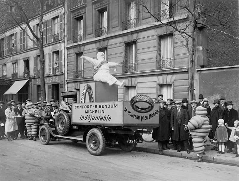
Bibendum also evolved alongside broader car culture, appearing in racing imagery, touring campaigns, and travel promotions.
These themes matched Michelin’s business interests, as the company was helping shape the culture of road travel itself.
That wider role connects Bibendum to the Michelin Guide, which began as a practical publication intended to encourage more car travel.
More travel naturally created more tire wear, and more tire wear created more tire sales for the Michelin brothers.
This link between travel guidance and product demand was commercially strategic, anchoring the mascot in the center of the motoring experience.
Bibendum became associated not just with tires, but with movement, reliability, route planning, and the experience of the road.
His appearance changed as tire design changed, moving from many narrow bands to fewer, thicker segments.
Early depictions reflected the look of bicycle tires, while later versions better aligned the mascot with modern tire construction.
That simplified form made him easier to reproduce across different media, though the core silhouette always stayed recognizable.
That continuity is a primary reason the mascot has endured for over a century without losing his brand identity.
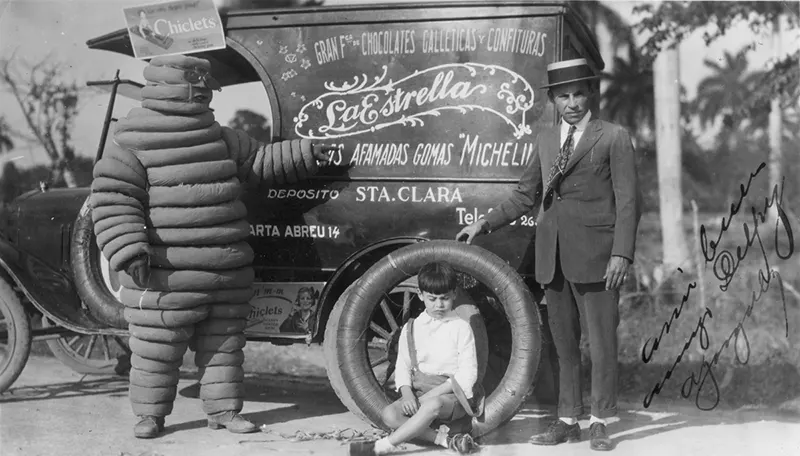
In the postwar decades, Bibendum entered a new environment where mass motoring expanded and family car ownership increased.
Advertising now had to address safety and mechanical trust, so Bibendum adapted to those needs by appearing more active and protective.
Campaigns often showed him with body language that suggested muscular power, which was a visual joke since his “muscles” were tires.
That message worked perfectly because the mascot’s body was the product, allowing him to embody toughness and reliability literally.
Few corporate symbols carry the goods they represent so literally.
This made Bibendum unusually flexible as a design tool.
He could embody comfort, toughness, expertise, travel, or brand familiarity without losing coherence.
Design historians often cite Bibendum as an early example of successful long-term mascot management, as he crossed major transitions in printing and illustration.
He survived the move from lithographic poster culture to magazines and television, eventually landing in the world of digital branding.
Few characters from the 1890s have remained so commercially active, and his level of global recognition remains exceptionally rare.

For collectors, Bibendum material offers several overlapping areas of interest, including advertising history, automotive history, and industrial design.
Enamel signs are especially popular because they are durable and closely associated with the golden age of motoring infrastructure.
Condition matters significantly, so collectors typically examine the gloss, any chipping, and the presence of rust at mounting holes.
Original mounting patterns and period-correct typography also help separate authentic vintage pieces from later reproductions.
The market includes many decorative reproductions, so provenance and close inspection remain important.
Bibendum items also appeal because the mascot’s design is immediately legible.
A collector does not need deep specialist knowledge to understand the basic charm of the image.
At the same time, serious specialists can spend years studying regional variations, production dates, material differences, and campaign-specific artwork.
That combination of broad appeal and research depth helps sustain long-term collector demand.

Today, Bibendum remains a global ambassador for Michelin, though his present form is cleaner and more simplified than the early versions.
The threatening banquet symbolism and elite accessories have disappeared, leaving only the core silhouette of stacked white tire forms.
That longevity explains why Bibendum matters beyond Michelin alone, as he is not merely a mascot but a case study in visual branding.
The character changed enough to stay relevant, yet stayed consistent enough to remain identifiable across multiple generations.
The character changed enough to stay relevant.
The character stayed consistent enough to remain identifiable.
That balance is difficult for most brands to maintain over multiple generations.
Keep Exploring Funky Junk
One interesting story often leads to another. Browse our Jewelry for vintage and collectible pieces, explore our ever-changing selection of Books, take a look through Current Inventory, or visit Canadian Trivia for more curious stories and discoveries.